The Student Aid Project is a user-friendly platform designed to help students and graduates tackle the complexities of student loans. It offers tools, information, and support, making managing student loans easier. The site simplifies loan applications, promotes financial literacy, and provides guidance on loan management and repayment. it is designed for mobile and desktop devices focusing on the user interface aspect.
Challenges
Students face significant challenges when seeking educational loans. They often find it difficult to access financial aid due to eligibility constraints and a lack of clear information about available resources. Many students also struggle with financial concepts, making it hard to understand loan terms and interest rates. This lack of clarity can lead to uninformed borrowing decisions.
👉🏻 the loan application process is often intricate, involving various documents and criteria, which poses a challenge for some students.
👉🏻 After graduation, high student loan debt becomes a substantial burden, particularly when managing multiple loans with varying terms.
👉🏻 The absence of adequate support systems, including a lack of access to financial advisors, compounds these challenges.
Furthermore, economic factors such as a challenging job market or unexpected personal circumstances can further impact a student's ability to repay loans. These pain points highlight the need for user-friendly solutions to simplify the student loan experience.
Our Solution
By conducting extensive user research and usability testing, we simplified navigation, redesigned the checkout process, and enhanced mobile responsiveness, leading to a 30% increase in conversions. We also introduced a personalized dashboard feature that allows users to track their orders, manage their designs, and access customer support easily.
We found some solutions while potentially beneficial to the users such as:
💡Streamlined Application Process:
* Simplify the loan application process by providing step-by-step instructions, eligibility checklists, and document submission guides.
* Implement intuitive online forms to reduce the complexity of applying for loans.
💡Loan Management Tools:
* To help users optimize their loan strategies, develop dashboard tools that provide information on upcoming bills, balances, goals, and expenses breakdown.
💡Clear Information:
* Provide comprehensive and easy-to-understand information about various types of student loans, including details on interest rates and repayment options.
* Offer user-friendly guides that provide clear and comprehensive information to help students make informed borrowing decisions. These guides should include details on various types of student loans, such as interest rates and repayment options, in an easy-to-understand format.
Value proposition
At Student Aid, we are committed to providing students with a personalized loan experience. We understand that each individual has a unique financial situation and academic path, which is why we offer customized loan recommendations. We believe in saying goodbye to one-size-fits-all loans and helping you with tailor-made solutions that fit your specific needs. With our assistance, you can focus on your education while we take care of your finances.
Design phase
The design process typically involves several stages, including research, ideation, prototyping, and user testing. The first stage involves gathering information about the project's goals, target audience, and any constraints. This information informs the next stage, ideation, where the designer generates a wide range of potential solutions. The designer then selects the most promising ideas and moves into the prototyping stage, where they create low-fidelity versions of the design to test with users. Based on user feedback, the designer iterates on the design until it meets the project's goals and user needs. Finally, the designer refines the design and prepares it for implementation.
Discover
Data collection and competitive analysis

In addition, we conducted a competitive analysis of five existing websites to identify their strengths and weaknesses and incorporate features on our website that align with our business needs and goals.
Key insights from competitive analysis:
Some designs lack engagement and are generic, basic, and unappealing in some cases. They are not user-centric and tend to be bureaucratic. They are more focused on other financial services and have a limited design focus. As a result, they do not fully convey the website's purpose.
Interviews
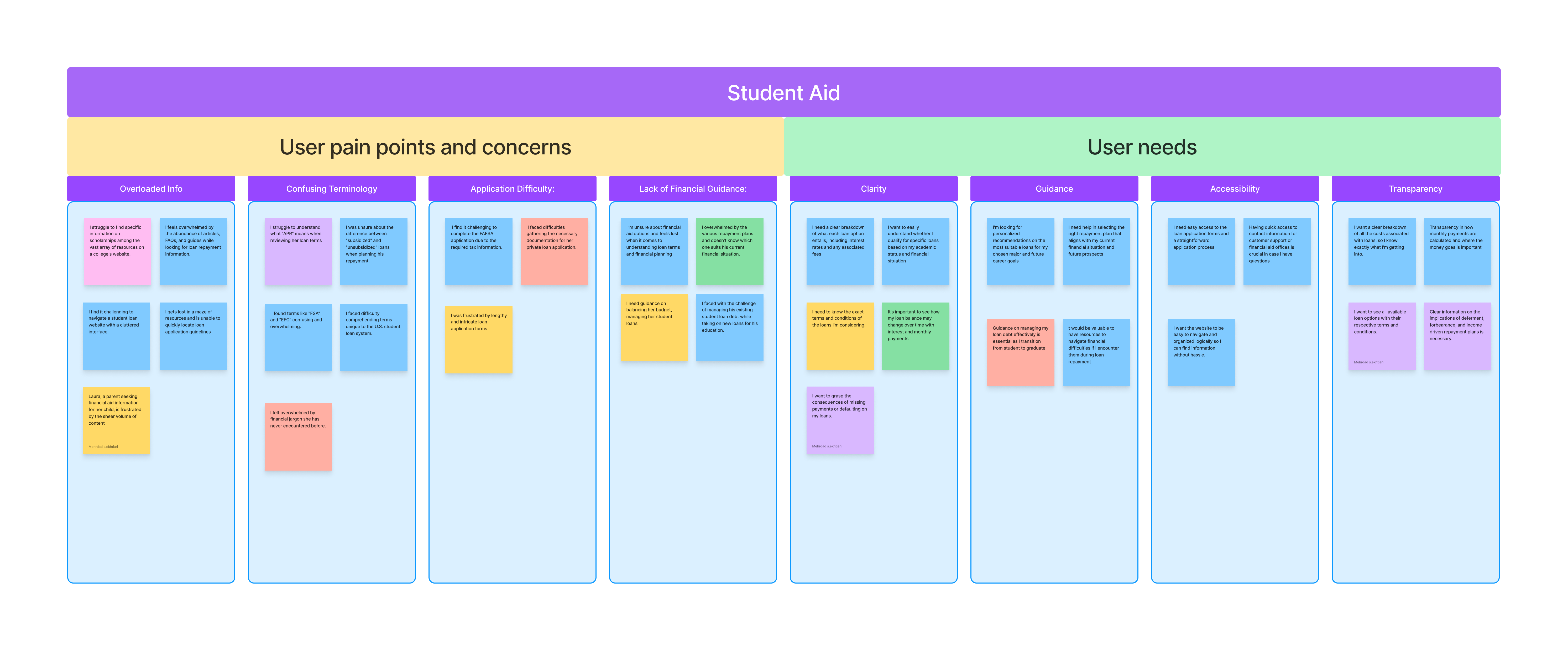
We conducted in-depth interviews with 8 selected users to gain a better understanding of their motivations, pain points, and expectations. Our interviews consisted of 11 open-ended questions, and we were able to complete them within a time frame of six days.Here's a summary of the critical pain points and user needs:
😡 Pain points
Complex Terminology: Users often struggle with the complex terminology related to student loans. Simplifying these terms is essential.
Information Overload: Websites tend to overwhelm users with extensive information. Streamlining content is crucial.
Eligibility Ambiguity: Users need clarity on eligibility criteria for various loans and financial aid programs.
Complex Application Forms: The loan application process can be intricate. Streamlining and simplifying this process is crucial.
Absence of Financial Guidance: Many users lack financial knowledge and require guidance on managing their loans effectively.
High Debt Stress: Graduates often struggle to manage high student loan debt effectively.
🙂 Needs
Clarity: Users need clear, concise, and easily understandable information about loan terms, eligibility, and conditions.
Guidance: Users require guidance on choosing the right loan, understanding repayment options, and managing their loans effectively.
Accessibility: The website should provide easy access to loan application forms, customer support, and financial aid resources.
Transparency: Users expect transparent information about all loan costs, payment calculations, and available loan options.
Support: Access to customer support, FAQs, step-by-step guides, and reminders is essential.
Target users

Our target users are typically individuals who are pursuing or planning to pursue higher education and may require financial assistance to support their academic journey. This could include individuals from a variety of backgrounds, such as:
current students
Prospective Students
Graduates & Parents and Guardians
The range of age our target users was broad. However, it would generally include individuals’ young teenagers, as they are more likely to need to pursue higher education.
Define
Persona
To gain a better understanding of our users' goals, needs, experiences, and behaviors, we created a persona based on user interviews and surveys. We continuously updated this persona as we gathered more data throughout the project. Whenever we needed to step out of our own perspectives and reevaluate our initial ideas, we referred to this persona.
User flow
Our team has iterated on the user flow, and this is the latest version that will serve as the reference for our wireframing
Site map
Based on the results of our user research and open moderated card sorting, we have developed the site map. The site map is designed to effectively balance the needs of the business and the users, ensuring a seamless user experience. The site map serves as a visual representation of the website's structure and navigation. It outlines the hierarchy of pages and provides a clear overview of how different sections and content are organized. This helps users easily locate the information they need and navigate through the website with ease. In developing the site map, we considered the insights and feedback gathered from our user research. We took into account the users' preferences, expectations, and pain points to create a logical and intuitive navigation flow. This ensures that users can find what they are looking for quickly and efficiently.
Design
Sketches & Wireframes
We started our design process by creating sketches and wireframes. This helped us to quickly iterate through various design options and communicate our ideas before moving on to the more detailed design phases.
Ui kit
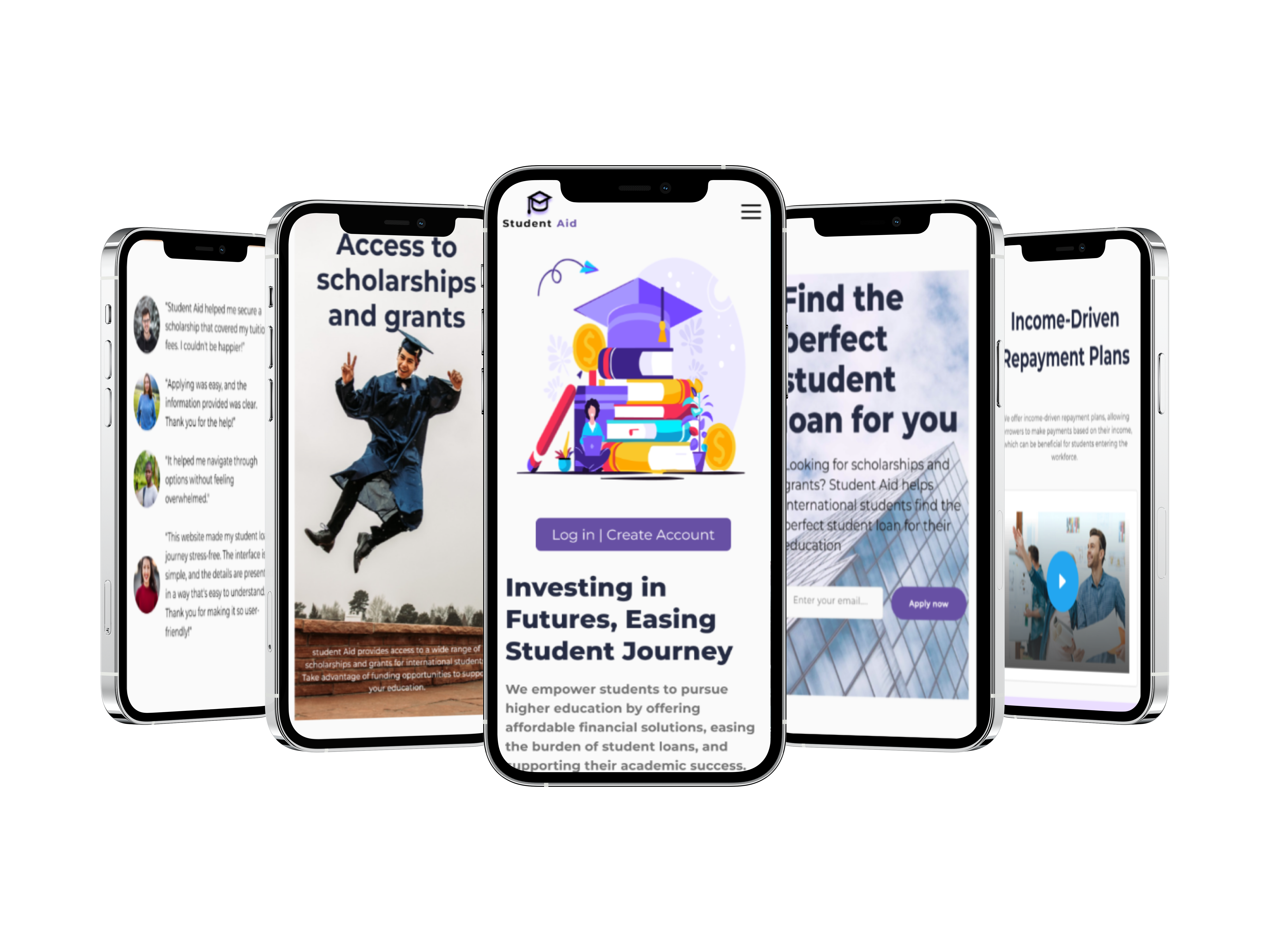
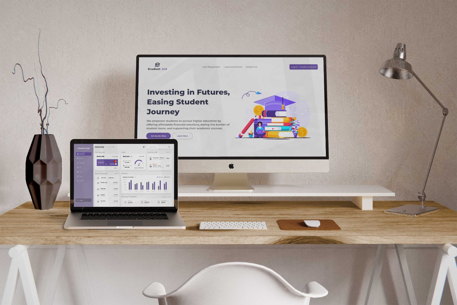
After conducting usability testing, we used Figma to design the final screens with a primary focus on creating a user-friendly, engaging, and accessible user interface (UI). Our design prioritized clear navigation, mobile responsiveness, simple forms, readable fonts, and engaging visuals. Consistency, interactive tools, and personalization options were also incorporated into the design. The ultimate goal was to create an attractive and user-centered platform that simplifies the student loan process, enabling confident and informed financial decisions.
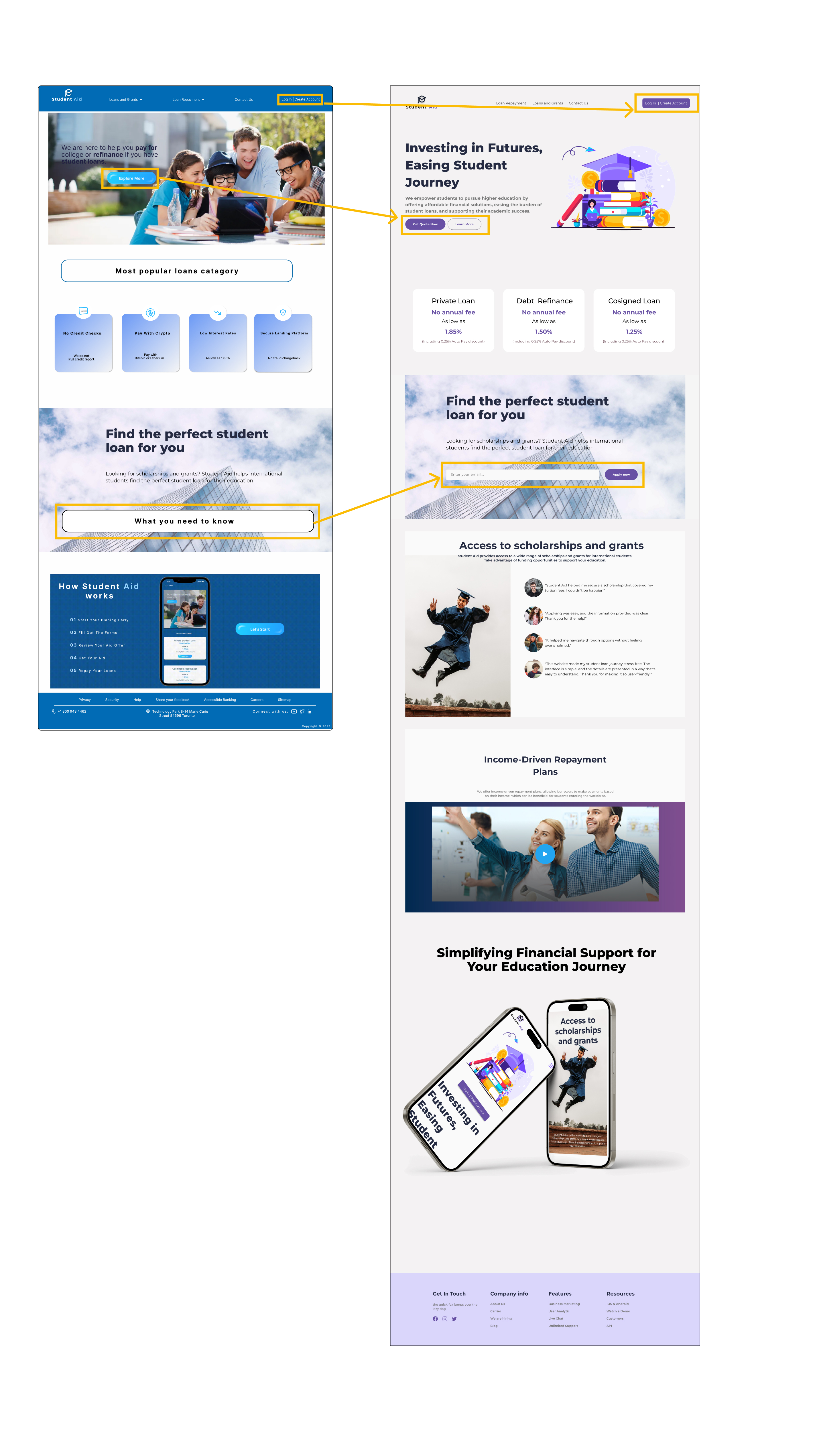
Hi-Fi wireframe
The high-fidelity design, which is finalized through iterations is shown below (in the next section, one of the iterations is explained as an example).
Deliver
Usability testing & iteration
After creating high-fidelity wireframes, we proceeded to iterate on the design based on the user's feedback. * To improve clarity and intuitive navigation, we have designed a minimal homepage that prioritizes essential content and streamlined user pathways. * To improve our consistency, we designed a responsive layout for both the website and mobile, ensuring a seamless and uniform user experience across all devices. * To address overload information, we streamlined content presentation simplified the interface, and introduced clear visual hierarchies, allowing users to access information with ease and clarity.